Sale on canvas prints! Use code ABCXYZ at checkout for a special discount!

Flashes of Perspective: Make it Pop! A Lesson about Color and Contrast (2/25/2013)
I am so excited! Today I get to discuss one of my favorite photography rules with you: the rule of color and contrast!
One of the things, I talked about in the last post was how to use color to balance out Rule of Thirds subjects. Today we get to delve deeper into the concepts of color, contrast, and how they make photos, well…pop.
Let’s Get Started
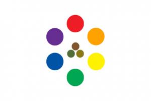
First of all, let us discuss a little thing you may remember from art class called the color wheel. For anyone who has ever seen a rainbow, you know that a rainbow is composed of the colors: red, orange, yellow, green, blue, indigo, and violet (purple). Science teachers often refer to these colors with the acronym ROY G BIV. For art students like me; however, ROY G BIV is usually just ROY G BV and is set up in a circle like the graphic shown with this lesson.
Red, yellow, and blue are called primary colors because they are the basis for all other colors. Orange, green, and violet are called secondary colors because they each are derived from two of the primary colors. Hence, red and yellow make orange, yellow and blue make green, and red and blue make violet.
The color wheel has two sides: the warm colors and the cool colors. Artists call red, orange, and yellow the warm colors or hot colors largely because they are the colors of fire and are used to brighten a scene. The colors green, blue, and violet are all considered cool colors and are used to soften or darken a scene.
If you draw a straight line from one color on the color wheel to its opposite, you have just chosen two contrasting colors. Since these colors are so opposite, they conflict with each other visually. This conflict is very useful to photographers (and artists in general) because conflict draws the eye to a particular subject. Thus, red and green, orange and blue, and yellow and purple are all contrasting colors.
Something else to note, is that if you take contrasting colors and mix them together you will get your neutral colors: brown, olive, and ochre. Thus, red and green make brown, blue and orange make olive, and purple and yellow make ochre. These colors are called neutral colors because they do not contrast with other colors and can therefore work with any of the primary or secondary colors without “stealing the show” so to speak.
Please keep in mind also that, since all other colors are reflected in the color white and all other colors are absorbed into the color black, that even though these colors are often considered neutral, they can still have more impact than any other color in a scene.
Understanding the relationship between warm and cool colors is very important when shooting photography because it helps the photographer understand how to light a subject. When you understand the power of color and can use it to create striking photographs, you will have the ability to amp up viewer interest in your work. The color of a subject will help distinguish it from the rest of the photo. In the case of Color and Contrast, the subject is usually the extreme in color compared to everything else — either the brightest color or the darkest color of the photo.
Let’s Break It Down
Primary Color Scheme Examples:
“Leaf Among Thorns”
Secondary Color Scheme Examples:
“Piranha”
White Color Subject Examples:
“Regal Plumage”
“Egret Alphabet”
Brightest Color Subject Examples:
“Variance”
“Ibis Ogle”
Darkest Color or Black Subject Examples:
“Black Hole”
“Colorful Perspective”
Color Contrast Subject Examples:
Yellow and Violet Contrast Photo
“Contrast”
Orange and Blue Contrast Photo
“Twilight Mushrooms”
Red and Green Contrast Photo
“Zendarians”
Photographer’s Note
Also something to note, is that color can and will affect how you shoot landscapes, so pay attention to your extremes even when you are using the Rule of Thirds and its Balancing principle to shoot landscapes or cityscapes. Remember, whether shooting vertical (the top and bottom are the shortest sides of the photo) or horizontal (longer sides are the top and bottom of the photo) shots, landscapes and cityscapes should be shot with the ratio: one-third land and two-thirds sky or two-thirds land and one-third sky.
Homework
Shoot at least 18 images: 3 of each color principle. You can stage a few shots by shooting crayons or colored pencils to get a feel for the principles, but please go out and shoot random objects that follow the rules. Remember, this is your time to express yourself, so have fun with the project. Trust me when I say that your attitude will directly affect the beauty of your photos.
Until we meet again, I wish all of you brilliant flashes of perspective!
[ O*] Alycia